Create a map displaying polygon shapes. Shape maps are a good way to visualize a given measure across countries, states, or counties. Selecting a meaningful logic to drive the measure color helps users to make quick assessments based on the formula that's important to them. For example, it may be relevant to you to rank sales by quartile, or to locate areas in which sales fall outside of the standard deviation. Or you may want to apply "positive negative" logic to net profit, to quickly pinpoint states where a loss was made by displaying them in red.
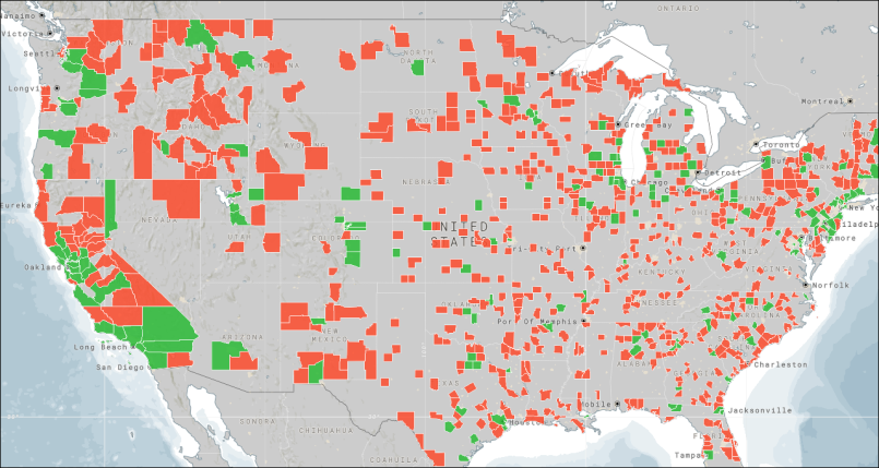
In the example below product sales are shown by county, and the color logic behind the heat map is average; green indicates above average, and red indicates below average.
You can change the colors displayed in the shapes (or bubbles) using the legend editing capabilities.
Note: shape data from cities and addresses is not supported.
Note: shape maps do not support latitude / longitude mapping.
Data Labels
The data labels feature is exposed when working with shape maps. By default, it is enabled to show values. You can also opt to show percentages and captions, or disable data labels.
Build a Shape Map
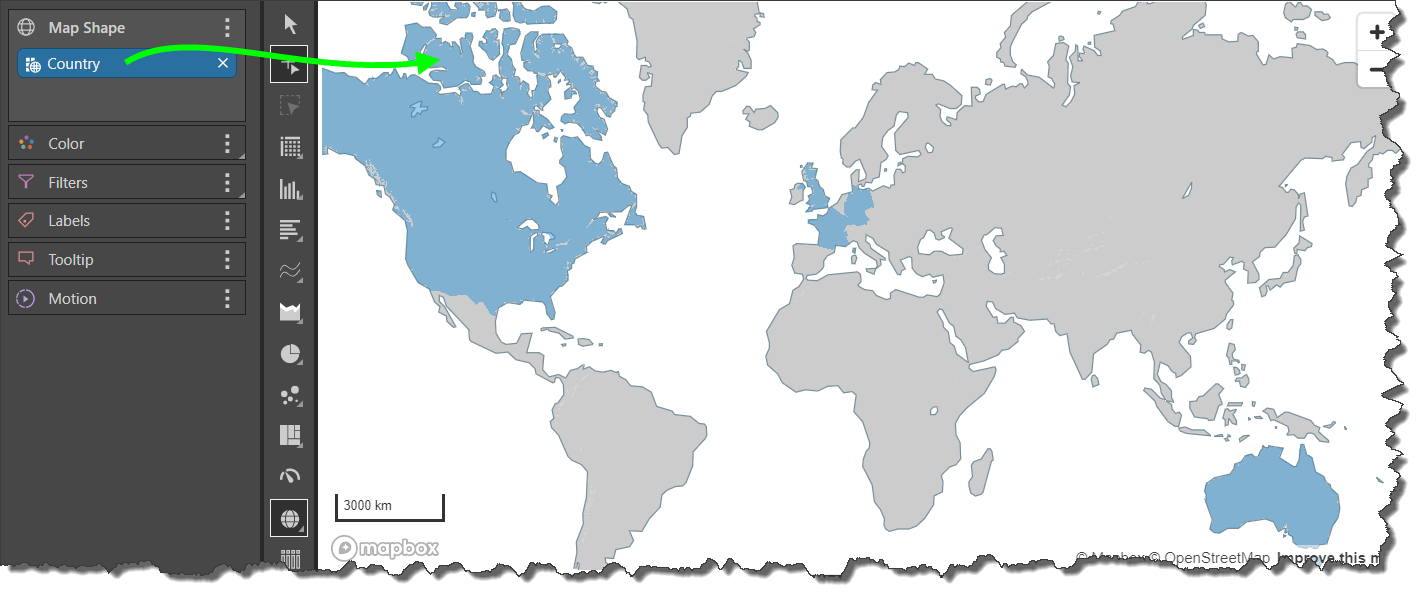
Step 1
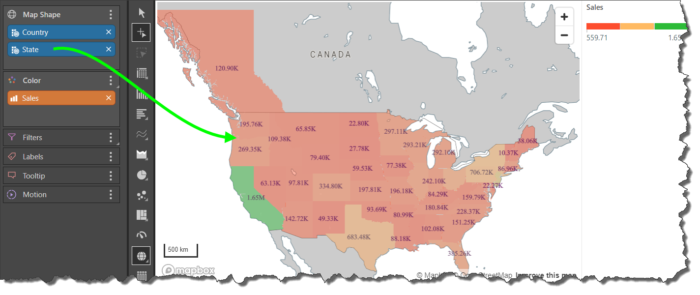
Add the Country hierarchy to the Map Shape zone; each country in the hierarchy will be shaded in the map.
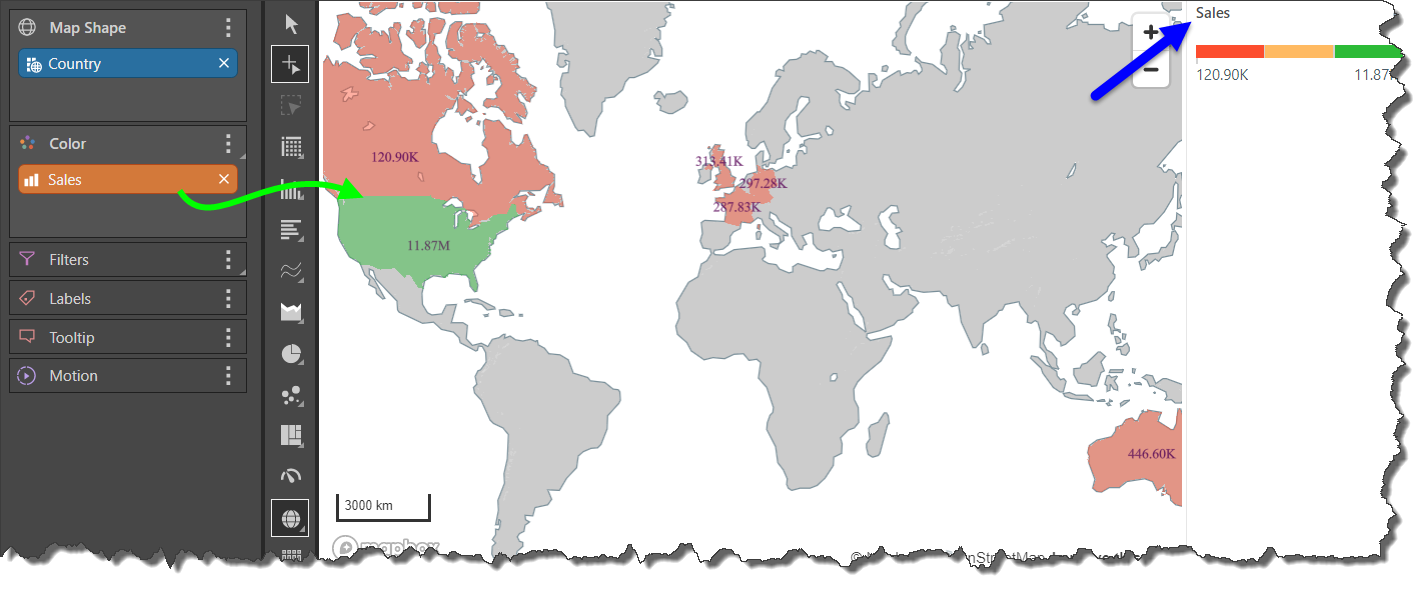
Step 2
Add the Sales measure to the Color zone; the color of each country will be driven by the sales measure (green arrow). The color scale can be read from the Sales legend (blue arrow).
Step 3
Add the State hierarchy below the Country hierarchy in the Map Shape zone; this will add shape data at the state level to all states in the query whose parent country is also in the query (green arrow).
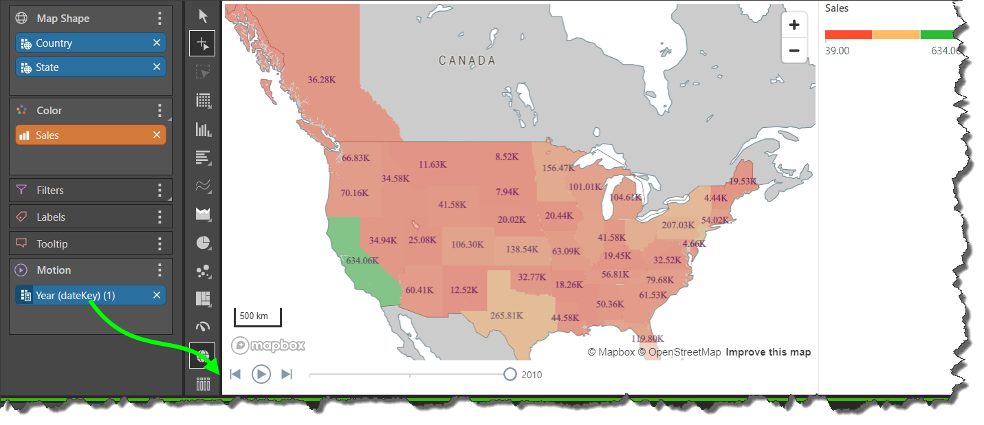
Step 4
Right click on the dateKey hierarchy to create a Year date part.
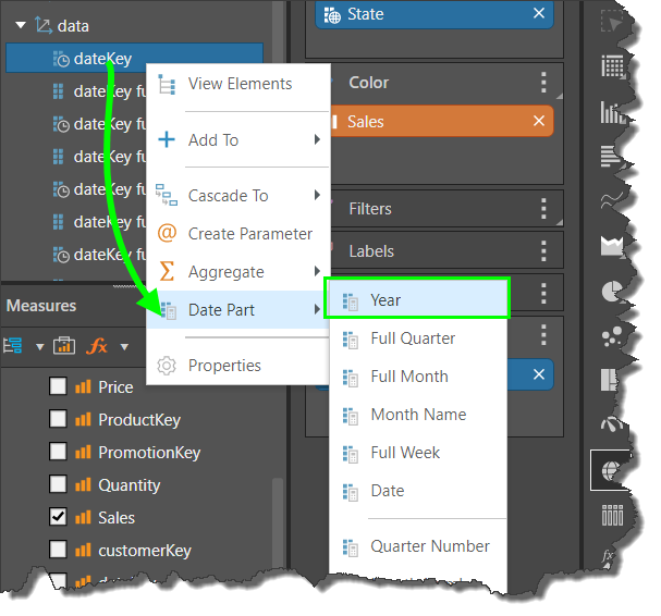
Move the date part chip to the Motion zone to produce a motion panel (green arrow) from which you can play an animation of the map by year.